Showing posts with label handwritten. Show all posts

Monday, December 3, 2018

MI # 21: In Which Dr. Inkenstein Has The Gall

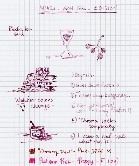
Dr. I does not know what to make of this Iron Gall ink yet...but loaded a Safari and plunged 'write' in. 

In the vial and the chroma, it's a cerise/fuschia color. But it dries dark. I believe it will flow better once it settles in to the pen.


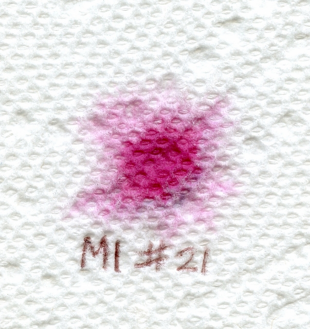
Not very complex flower chroma, but interesting in that it retains the brighter color element:


The ink was very unhappy when Dr. Inkenstein wrote to a pen pal using Clairefontaine paper. It writes better on Rhodia Ice. Which hardly even makes sense.

In any case, I love doing Mystery Inks; this one turned out to be Platinum Lavender Black. Thanks, Scooby!

Monday, August 20, 2018

MI #20: In Which We Discover Green

We give you...Mystery Ink # 20.


Green is the opposite of dry, right? Green fields, green leaves, mint-green liquor drinks with green umbrellas and a pineapple spear.

This is green. This is dry. 


Ink flower chroma:


Hana no inku shows a teeny bit of a yellow halo. And maybe even a hint of red center? I like it.

Paper was Rhodia Ice. 

Shading? Maybe the nib wasn't broad enough. And Dr. Inkenstein keeps waiting for the ink to get dark. Because in the bottle, it looked dark. 

Changing the ink cart to a UPS-logo pen of uncertain ancestry did not change the dry-itude.  But it has grown on me, and the UPS pen was refilled when it ran low.

As to guessing the brand and color.... NO idea.  But it was revealed as...another Colorverse ink!  Sea of Tranquility, to be exact.  

Mystery Inking is so much fun.

Monday, July 23, 2018

The 19th Mystery: In Which etc. And So Forth

Ahhhh! One of Dr. Inkenstein's favorite color families, judging from the  approximately one million turquoise inks in my possession, and this is timely, because in the summer I always have one turquoise-loaded pen, and it just got cleaned.

MI #19 was tested in a Parker Reflex and on Rhodia grid. I just happened to have a turquoise Pilot Varsity on the desk, and grabbed that for comparison's sake. They look vewy, vewy similar.


I also ran a paper towel chroma on both MI #19 and the Varsity. Even this is quite similar.


So far, no hard starts, no southpaw smearing, but mayyybeeee a touch of sheen? Judging by the amount on the Reflex's feed....


MI #19 started to run dry in its Parker Reflex and needed dipping to start.  Dr. Inkenstein believes this to be a converter problem. After advancing the ink, it seemed to flow again.  And as another bonus, we discovered that the Parker Reflex takes Lamy carts just fine.

Just when it was decided that this is a good ink, MI #19 was revealed as 'Special Edition ink' Lamy Pacific Blue.  Which, it turns out, is the same ink as Lamy Turquoise.  Which Dr. Inkenstein already has.  

Win!  

Monday, June 11, 2018

The 16th Mystery: In Which Dr. Inkenstein Misses the Guess Yet Again

(Can this be true?  Is Dr. Inkenstein the first one to get MI # 16 in the mail this time? Woohoo!)

Here we go, then, live, as it happened.  Over to you!

In any case...I like this ink! It's a slightly green-leaning blue with excellent behavior. NO hard starts at all at first, but when it lay in the pen awhile, alas, yes.

Plus, it looks pretty in that Dollar demonstrator.

Here it is also compared it in color to a couple of similar-looking inks.


The guesses which were wrong: Monteverde Horizon Blue, Iroshizuku Kon-Peki.  Actual Mystery Ink was Colorverse Crystal Blue Persuasion, I mean, Crystal Planet.  No chroma this time.  Dr. Inkenstein pleads forgetfulness....and more Mysteries to come.

Friday, April 13, 2018

Mysteries Continue: In Which Dr. Inkenstein Is Wrong Again

More Mysteries at hand for Dr. Inkenstein in....

...The snow report! This was kind of a rush job...snowstorm (that is, when this was first composed!), power loss (no heat, light, or innerwebz)....got power back today, got ink a couple hours ago.

Loaded directly into a Sheaffer No Nonsense, which doesn't get on very well with the ink, though I thought it would. But I wanted to use a cartridge pen this time, ratherthan the Dollar piston-filler. I might swap the cart into a slightly better Sheaffer.

A light, bright springlike (and we could use some spring!) ink. Lighter than both the MB Irish and the JH Lierre Sauvage. No sheen for me, hardly any shading. I see a turquoise halo in the chroma, which may not show up in this scan. 


You'd think Dr. Inkenstein woukd have guessed correctly this time.  Especially since the MI in question was ALSO one I own, and RIGHT THERE ON THE PAGE AS A COMPARISON.

Hint:  it wasn't MB Irish Green.  Mystery Ink # 15 was JHerbin Lierre Sauvage. Which I own.  And had loaded.   Will I ever get one right?  Tune in next time.  The Ink Mysteries continue.....

Wednesday, December 2, 2015

School Daze: In Which Dr. Inkenstein Returns To The Past

Uh-oh...new obssession, er INTEREST, on the horizon.  


Got this grouping from Peyton Street Pens at a great price, playing into Dr. I's newfound Whatever: vintage-y Sheaffers.


Testing that group of Sheaffer school pens with a dip in Skrip, then loading one with Diamine Schubert.  Dr. Inkenstein's first fountain pen was one such Sheaffer school pen, with the chrome cap and a translucent yellow body.  Somewhere along the way, that pen was lost.  It was a treat to grab these five from Peyton Street Pens.  The anassuming little Sheaffer School pen through the ages.  the shape and materials may change from decade to decade, but always reliable, alwaus fun to use.  They do not come much better for the price.


Monday, August 10, 2015

MI-10: In Which Dr. Inkenstein Gets Beachy

Just havin' some fun, as the Summer Mystery arrived:


One final addition to the MI-10 Experience: I had neglected to run a chroma, so I did a quickie here.


These two were inks I might never have tried, though 'Carli' is a color right up my alley, and if I were buying an Edelstein it would be this 'n. I didn't notice the dryness many people mentioned in their reciews, but the Rotring Artpen might be a garden hose.

Loved working with 'Lloyd.' It glides in the pens I used, I see lavender and turquoise notes in the chroma. Oddly enough, 'Lloyd' seemed to have an affinity for my fingers like no other ink...ie: every time I opened the vial, some of it leapt onto them. 

So thanks once again to the Undisputed Queen of Ink-stery, for the opportunity to try a range of inks I might not have otherwise sampled.  

Stay tuned for more.

Tuesday, April 21, 2015

Ah, Sweet Mystery of Ink! In Which Dr. inkenstein Reveals Part One

On the Fountain Pen Geeks forum, we have been playing a wonderful Ink Guessing Game, started by KLP and Laura N.  

Here's how it goes:  They send us a sample vial of Unmarked Ink.  We test it, not knowing the maker or color name, so we won't be unduly influenced by Industry Hype (ie: 'This is the Best Ink Ever!' Or, 'This Ink Will Eat Your Pen Alive!'). Sort of, almost, like a double blind science experiment.

And as we all know, Dr. Inkenstein loves science experiments.  Muahahaaaa.

I missed MI 1 so...

It started with MI 2.

By chance, I believe I picked the perfect pen for this Mystery Ink:


The image is scanned so you can't see much shading, but I believe there is some. For a wet ink, it still dries fast enough for this southpaw overwriter.

This has been such fun, and I can't thank you two enough for the opportunity.

PS: Chroma:


(MI 2 was revealed as Sailor Kobe Maiko Green.  Loved it.)


MI 3 proved to be a bright spot in a dark winter.

Here are just my quick impressions, but I love it too! It's not anything like any color I have or know...I call it Raspberry Sorbet. 

The chroma reveals a not-all-that-complex color halo, unlike some of my other inks, which fan out into multi-hued coronas. That's okay.  I found that J Herbin Rouge Bourgogne had a very similar chroma, but...that waan't this ink.

Have I mentioned I loved this ink? 

It dries fast enough, and does not seem quite as wet as MI 2. But it seems unique. (Now, given that I was wrong with both my MI 2 guesses, watch this 'become' an ink I already own and use, lol).

Thank you both, Laura and KLP, for this wonderful ink-ertunity, and for brightening up a snowy winter day.


This ink turned out to be...Caran D'Ache Sunset.  Never used a CDA ink before, and sadly, this is a discontinued color.  It got a little bit sticky in the pen after a coupoe of weeks, refusing to dry well.  Coulda been the pen.  Anyway the ink was a wonderful color and fun to use.

Up next: Part Two!  With at least two more inks!

Monday, April 20, 2015

Ahh, Sweet Mystery of Ink Part 2 : In Which Dr. Inkenstein Continues

When we left off, on the FPG forum we have been playing a wonderful Ink Guessing Game, started by KLP and Laura N.  

Here's how it goes:  They send us a sample vial of Unmarked Ink.  We test it, not knowing the maker or color name, so we won't be unduly influenced by Industry Hype (ie: 'This is the Best Ink Ever!' Or, 'This Ink Will Eat Your Pen Alive!'). Sort of, almost, like a double blind science experiment.

And as we all know, Dr. Inkenstein loves science experiments.  Muahahaaaa.

It started with MI 2.

Now here it continues with MI 4 and beyond.

 
Thank you both, Laura and KLP, for this wonderful ink-ertunity, and for brightening up a snowy winter that lasted well into what was allegedly spring.


It was six degrees out with howling wind! But MI 4 saved the day. 


Continuing in the tradition: I love this ink! It plays so nicely with the Hero and the Bagasse, and was a great color for snowy, cabin-fevery February.

Now that I look closely I may see hints of darkish green in the chroma's center and corona. I have a certain ink in the back of my mind (mostly due to the excellent flow and hue) but I'm probably wrong.

As usual.  And nope, it wasn't Chesterfield Mahogany, but revealed as De Atramentis Black-Brown.  These DA inks...innnteresstinnng.

Thanks once again to the Mystery Team that makes this possible!

Now, MI 5:   Wow. Yup. Orange. Where are my sunglasses? 


You will see that the AS shows more burnt-orange and has much more shading. FG is notably darker and more pink. Glitterpreppyyellowbrown is just...odd, by comparison.

MI 5 writes smooth in the pen and dries quick enough for my southpaw-y-ness. It seemed to flow fairly well in this dryish italic Nemo, which, as a demonstrator, helps to show off the liquid Vitamin C-power of the Mystery Ink.

And now for the paper towel chroma. 

Top: Apache Sunset
Middle left: Iroshizuku Fuyu-Gaki
Middle right: Preppy Yellowbrownwithcopperglitter
Bottom: Teh MYSTERY ink!

Don't they look like flowers? I have NO idea how that dark spot got onto the MI 5 'flower.' Probably a rogue microparticle of blue ink got jealous and flew right into the middle. Somehow.


I do have my suspects. Two of them. But I have been wrong with every. Single. Guess so far.

This was a wonderfully cheery ink for a chilly week in March when we expected TWO TO FOUR MORE INCHES OF SNOW. Will be using it to reply to some letters!

So thanks once again to our Queens of Mystery!

You will see that the AS shows more burnt-orange and has much more shading. FG is notably darker and more pink. Glitterpreppyyellowbrown is just...odd, by comparison.

MI 5 writes smooth in the pen and dries quick enough for my southpaw-y-ness. It seemed to flow fairly well in this dryish italic Nemo, which, as a demonstrator, helps to show off the liquid Vitamin C-power of the Mystery Ink.


And now for the paper towel chroma. 

Top: Apache Sunset
Middle left: Iroshizuku Fuyu-Gaki
Middle right: Preppy Yellowbrownwithcopperglitter
Bottom: Teh MYSTERY ink!

Don't they look like flowers? I have NO idea how that dark spot got onto the MI 5 'flower.' Probably a rogue microparticle of blue ink got jealous and flew right into the middle. Somehow.

I guessed that this might have been either J Herbin Orange Indienne, or Chesterfield Fire Opal.  It wasn't.  It was....Montblanc Gandhi!  Which isn't even available any more!  So I now have a vial of this Officially Rare Unobtainable Ink.

As for MI 6:

This is a slinky ink! The flow and smoothitude was remarkable. With a single dip, I was able to write this mini-review, AND a short letter to a pen pal. However, several hours later, tendrils of purple/pink were still emerging from the nib.

I think MI 6 would pair well with MI 3. The CDA Sunset that looked like raspberry sorbet. 

For my own identification purposes, I'm calling it Elderberry...though there's no such ink name as far as I know. *


The scan makes it look almost black. Though it is very dark, it has lighter and warmer tones than shown here, though no shading that I can see. But talk about flow! No smearage, either...a boon for us southpaw hookers. 

Like Laura N, I'm not a big purple ink person, but this one has some wonderful properties. I'm enjoying it.

PS: last night the water in which I was soaking the dipped nib finally ran clear....BUT when I applied paper towel to the nib, nope. So I accidentally did a chroma, lol. Slate and hot pink says it well.


* There was...but I didn't know that at the time.

This was another De Atramentis ink: Aubergine.

Wrong again.  But well, at least it was a FOOD.  

What ink shall be next?  It's a mystery to me.

Friday, February 8, 2013

Knockaround! In Which Dr. Inkenstein Writes Blue-Black

Sometimes, you can’t manage a Big, Important Involved Post, like Superhero Pens, but you want to post something because you got some new inks to test.
 
Also sometimes, you just want a knockaround ink, you know? An ink that doesn’t come in a ‘collectible’ bottle, an ink that doesn’t cost a fortune, an ink that is easy to open and isn’t overfilled and doesn’t tip too easily and you don’t have to approach with fear, awe, and trembling.
 
You inks out there know who you are.
 
 
To this end, Dr. Inkenstein sent for a bottle of New Formula Skrip Blue-Black ink, as opposed to the vintage formula that came in the inkwell bottle and was impossible for me to open. This came to about ten bucks…could have found it for less money in Real Life, but was impatient. Will never again order from this particular vendor; the tiny box was un-padded and bulging, but the ink miraculously arrived intact. And NO. The dealer was not isellpens, Jetpens or Goulet Pens. Rest assured of that.
 
 
Also ordered a bottle of Hero Blue-Black ink from fleabay. At about five bucks shipped, this is the Bargain of the Bunch.
 
Why is Diamine Denim included? Because it’s in a Knockaround Pen, one of my trusty and well-loved Platinum Preppys. And because I had a test bottle of Denim on hand, bigger than a sample, far less than a full bottle. We hates these small bottles. Hard to squeeze a nib into, all too easy to tip over. Diamine isn’t exactly Knockaround Ink, but the full-sized bottles are at least stable, easy to open, and difficult to tip.
 
I dip-tested the Skrip and the Hero inks using different pens, shown here on a Clairefontaine Grid Pad and shot with a very bad digital camera of sorts with no close-up feature:


Then I further disgraced myself by dip-testing all the inks with a horrible, no-name glass pen. This pen would make a professional calligrapher write like a cross-eyed monkey tanked up on espresso, so it had no difficulty whatsoever in making Dr. Inkenstein’s southpaw scribble resemble blue worms on a plate.


I also tried diluting each ink with first a water-dip, then a cotton swab smear. The Diamine Denim seems to have the least green undertones of the three tested inks, and may be the ‘truest’ blue of the bunch. But I kind of favor the Hero ink at this point, for a combination of price, bottle, and just because.
 
 
As for each ink’s shading properties, it’s too early to tell, and besides, it’s snowing. And there’s a loose chicken in my yard.

Friday, September 14, 2012

Four pens: In Which Dr. Inkenstein Scribbles Notes


Long time no blog: plenty of ideas and pens and inks in the hopper, though.

Today Dr. Inkenstein scribbles with four new fountain pens and two new inks.  And could not be happier.

The first, a Hero, is utterly gorgeous, copper colored with a raised fleur-de-lys design and pewter-looking clip.  For some odd reason the shape reminds me of an ST. Dupont build.  The nib is said to be flexible.  If Todd still has these, he's got better pix than I can take.  Please have a look at this pen's gorgeousness.


The second may well be my fave of the batch: a shiny gray Nemosine Singularity from xfountainpens (and much more on them in a later post).  It's a substantial, smooth, well-steering model with a rounded stubbish calligraphy nib that, on a single dip in Noodler's Rome Burning,  laid down at least three slinky paragraphs.  

 Dr. I also wonders why so many people dislike RB ink.  It's nearly a dead ringer for Pelikan Khaki, which I love and which is 'out of print.'

Pen Number Three is a monster.  Seriously.  It could star in its own movie: Pen Nine From Outer Space.  Heavy, mirror-finish, fat silver torpedo.  Another from xfountainpens.  

 These are probably rebranded Jinhaos, and the M nib here is smooth enough.  I just. Didn't. Expect. Such.  Huge.  Shininess.

Last,  an amazing piece of work  is the Duke 'Chinese calligraphy' nib, and just one more in my growing fude collections (see Nose In The Air for further examples).  It, too, is massive, heavy, and comes in a presentation box with ink and a cart AND a booklet.  In Chinese.  Which Dr.Inkenstein cannot read.  

Its nib is somewhat different from most of my fude, being bent at a more severe angle and having two nib slits.   Another one from isellpens; pics on that website.

These will be reviewed in more detail at a later date.   For now please enjoy the random scribbles.


Friday, June 15, 2012

Spy vs. Accountant! In Which Dr. Inkenstein Compares The Inner Pen-sonality

Bond. James Bond.
 
I don’t understand the characterization of the Hero 007 as cheap and flimsy. Maybe the price is low, but right off the bat, the spy pen wrote with a buttery feel and excellent flow.
 
Whereas the Accountant (Guanleming 978), while deceptively elegant in appearance, wrote reluctantly, dry-er, somewhat scratchier, though it got easier as it went along. And, befitting an accountant’s pen, it’s a little bit particular about the paper with which it associates. Unknown yellow lined pad, begone. Office Max comp book, we can live with it. We just don’t love it. Staples bagassee, now that’s more like it.

Spy Pen, Accountant Pen:


This particular accountant probably works for James Bond. Hence, the fancy-dress. Someone’s got to do the books.
 
 
Here we have the case of two pens whose personalities contrast their looks. The Spy Pen looks like it belongs to an accountant. Which makes sense. You don’t want a neon sign flashing, "Hey! I’m a secret agent! Everybody watch out!"
 
 
No, you want to do your work undercover! So it’s fitting that the spy and the accountant swapped clothes. After all, if you’re an accountant, people aren’t shooting at you and aiming giant lasers at your personal areas. At least, not most of the time.
 
Sleek and silver and black. James Bond in a tux, watching out of the corner of his eye.
 
Silver and gold with patent-leather black section. M’s most trusted bookkeeper.
 

Behold the two tests and judge for yourself.
 
James Bond:


Accountant:


The 007 James Bond pen (donated to me by a kind member of FPN) is available from various ebay sellers.
 
 
The GLM is available from isellpens, who also has much better pictures than I am able to take. He probably uses a spy camera.

Monday, June 6, 2011

A Wing and a Sung: In Which Dr. Inkenstein Compares New Toys

Recently, Dr. Inkenstein broke the Unofficial No New Pens rule, with the purchase of a few inexpensive pens from isellpens---mostly Chinese, one Japanese, none costing over fifteen bucks, a couple as cheap as two bucks. Here's a picture-heavy overview.

All four pens, plus notebook plus ink.  Dramatic lighting (ie: iz DARK!) courtesy of early morning.


Burgundy Wing Sung, notebook, bubble wrap, dramatic (DARK!!!!) lighting:


The handwritten comparisons were accomplished by dipping each nib in Levenger Gemstone Green (thank you, Contrasuggest, for the gift of this ink!), which Dr. Inkenstein liked so much  that I will soon purchase a blue and a red from the same manufacturer.


We have two 'aero' fillers and one cart-filler.  The burgundy Wing has a removable squeezy filler, but this does not mean it can accept standard international cartridges. Believe me. I tried.


The black Wing Sung would do well with any ink, provided you remember what color is in there; the cute little amber clutch ring probably distorts hue. The gold check WS would also be happy with any color, but of course the burgundy will have to be content with reds and, well, burgundies, like J Herbin Rouge Bourgogne.
 

It is baffling why they call this Plaisir 'yellow.' It doesn't read yellow but soft molten gold, very appealing, perfect for inks in the red-brown-gold family, like Sheaffer King's Gold, or J Herbin Terre de Feu.
 

All told, Dr. Inkenstein stands in amazement. No, these are not high-end Sailors nor Pelikans. They are decent writers, nice inexpensive pens, representing good value. The Plaisir may be the cream of the crop, with its gold-pearl finish, but for their two dolla' tag, the Wing Sung 235 and 840 are pleasant surprises.

 
(Insert obligatory MUAHAHAAA. Because you still await the unfolding of the Mystery Sock!)
Monday, January 31, 2011

In Which Dr. Inkenstein reviews... The Doctor Pen

 
How appropriate a name for Dr. Inkenstein's newest fountain pen acquisition! And it's
perfect, or almost, but for one slim quibble.
 
 
More on that quibble later.
 
 
Dr. Inkenstein was given this pen to test-drive by a kindly invisible friend. The Doctor Pen is NOS, and sells for about $14 when you can find it, and it writes ---AND looks---like a much, much more expensive model.


It is quite elegant-looking, in flat-top form with a deep marbled-amber finish that makes Dr. Inkenstein go, "Oooo, shiny! Pretty!"


These phone-pics don't do the pen justice at all.  The metal cap closes with a nice 'click' and posts well enough, but makes the pen somewhat heavier to use.
 
 
With its silvertone trim and an unusual, multi-angled nib that is as smooth as anything Dr. Inkenstein has test-driven so far, the Doctor Pen (made, reportedly by Hero) has worked its way into my heart, and no doubt my rotation.


The one slim quibble is indeed its girth. While it's comfortable enough to hold, with Dr. Inkenstein's particular pen-gripping needs, I can not see myself writing page after page with this. Which is a shame, really, because the nib is SO nice. And the finish. Have I mentioned that the finish is pretty? Shiny?
 
 
If slim pens are up your alley, or even if they aren't, you will be pleasantly surprised by this little-known, unassuming pen.
 
 
Dr. Inkenstein has a happy.